


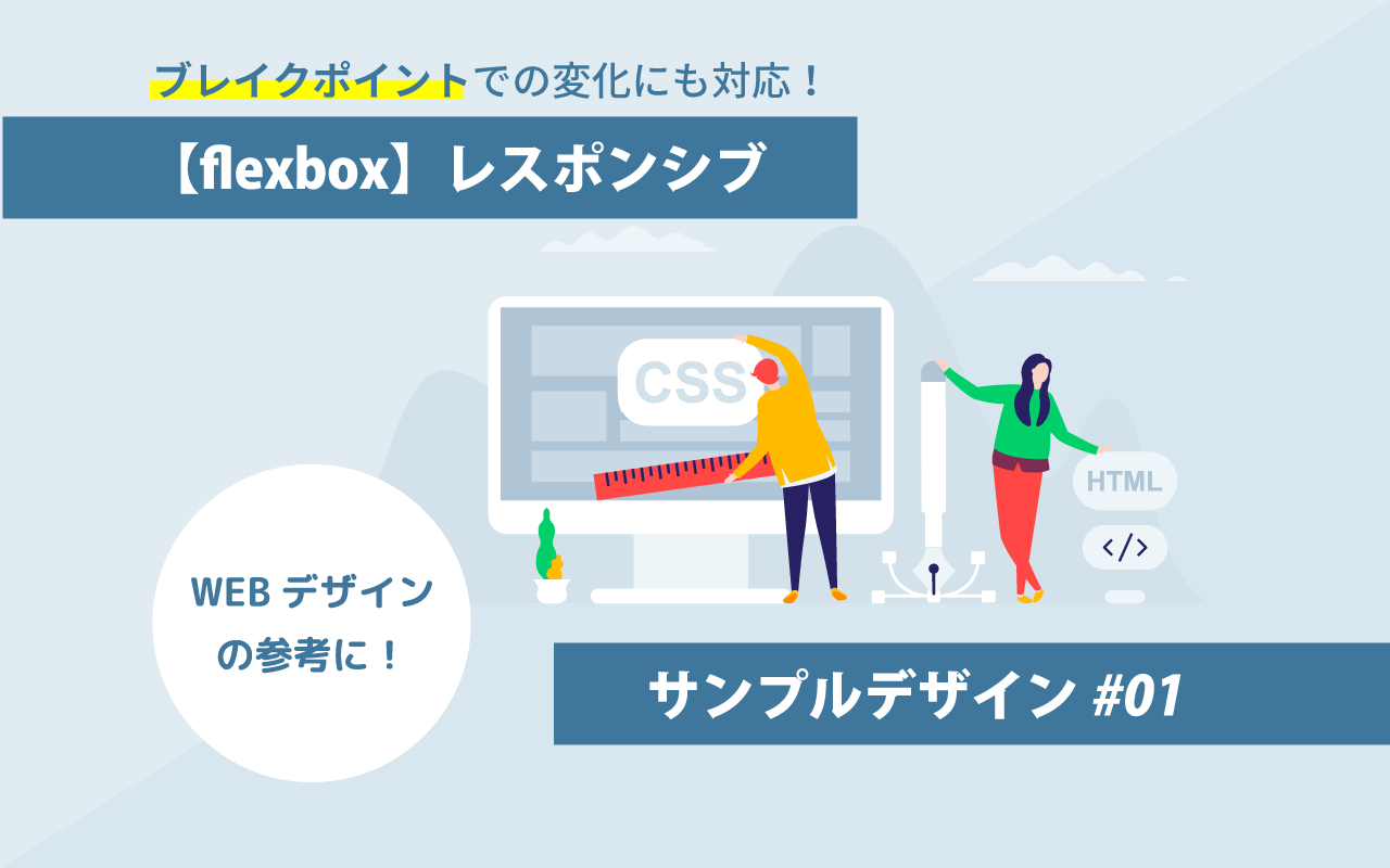
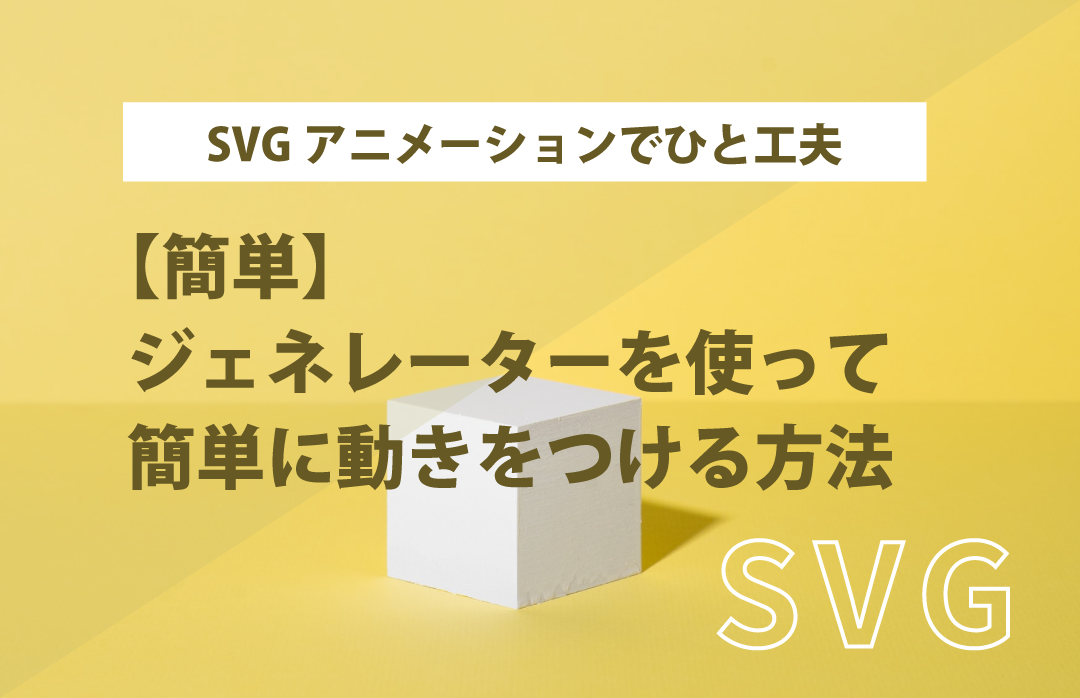
今回はflexboxを使用してレスポンシブのボックスデザインを作成してみました!
ウィンドウサイズに応じてflexboxのレイアウトが変わります。
実際のデモはこちらからご覧いただけます✨
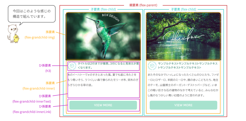
今回はflexboxの親要素~孫要素・ひ孫要素まで配置しています。
孫要素等が混ざってくると、CSSだけで高さを揃えることが若干難しくなってきます。
後からの修正は面倒な場合があるので、先にレスポンシブに対応する際にどのようにflexboxを組むか考えて配置する方が良いかと思います。
先に完成系のHTMLとCSSを確認したいという方はこちらをご確認ください。
ウィンドウサイズが1280px以上の場合
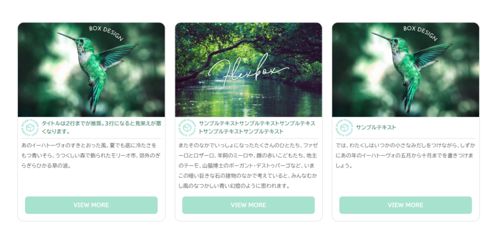
ウィンドウサイズが1280px以上の場合は 3カラムで子要素は横並び・孫要素以下は縦並びです。
タイトル部分は2行までが推奨です。
ウィンドウサイズが1280px以下896px以上の場合
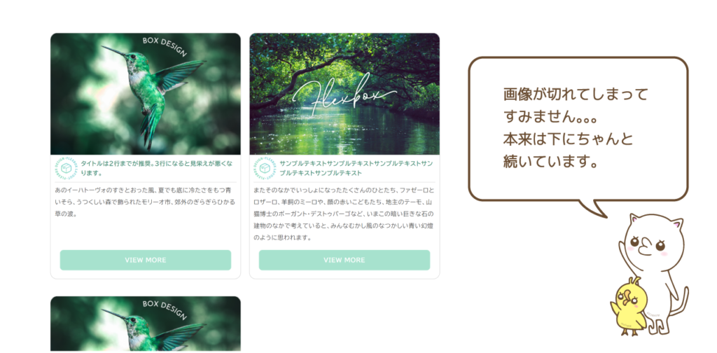
1280px以下でタイトルが3行になって見栄えが悪いので、2カラムにしています。
この場合はflexboxの横並びで折り返しを行い、子要素の幅を2カラムになるよう49%に調整しています。
全体の横幅が広すぎると感じる場合は、親要素の横幅を小さくしてください。
- 親要素にflex-wrap:wrap;で折り返し指定
- 子要素の幅を49%に指定
- 子要素の3つ目以降にmargin-topで余白指定
ウィンドウサイズが896px以下786px以上の場合
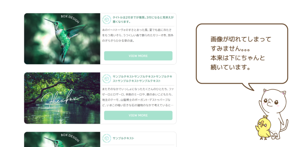
ウィンドウサイズが896px以下786px以上の場合は1カラムにしています。
この場合、子要素もflex-direction:row;を指定して孫要素を横並びにしています。
テキストの部分の高さを設定しないと画像サイズが揃わなかったので、テキスト部分は4行までの表示で最小の高さを設定しています。
- 子要素の幅を100%に指定
- 子要素の2つ目以降にmargin-topで余白指定
- 子要素にflex-direction:row;を指定して孫要素を横並びに
- テキスト部分に4行まで表示指定・最小の高さを指定
ウィンドウサイズが786px以下の場合
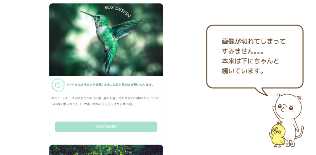
ウィンドウサイズが786px以下の場合は1カラムにしましたが、flex-directionにcolumnを指定して縦並びにするのではなく、すでに親要素に折り返しを設定してあるので子要素の幅を100%にして縦並びにしています。
子要素にflex-direction:column;を指定して孫要素を縦並びに戻しています。
ただ、やたら大きく感じたので、全体の横幅をウィンドウサイズに対して70%にして
余白を設けてスッキリさせました!
1.親要素flex-parentの横幅にwidth:70%を指定
2.子要素flex-childにflex-direction:column;を指定して縦並びに
ウィンドウサイズが480px以下(スマホを想定)の場合
ウィンドウサイズが480px以下(スマホ)の場合は、
全体の横幅をウィンドウサイズに対して70% だと見にくいので90%に指定しています。
1.親要素flex-parentの横幅にwidth:90%を指定
flexboxを使用したレスポンシブデザインの完成系HTML&CSS
flexboxを使用したレスポンシブデザインの完成系HTMLとCSSです。
各ウィンドウサイズで幅などが異なるので必要部分を抜き出していただいて、個別に使用しても良いと思います。
flexboxレスポンシブデザインのHTMLサンプル
<div class="flex-parent">
 <div class="flex-child">
   <div class="flex-grandchild-img">
     <img src="../img/flex/box-child1.png" alt="flexbox高さを揃えた画像1">
   </div>
   <div class="flex-grandchild-inner">
     <h3>
       <img src="img/icon-flex.svg" alt="アイコン">
       タイトルは2行までが推奨。3行になると見栄えが悪くなります。
     </h3>
     <div class="flex-grandchild-innerText">
       あのイーハトーヴォのすきとおった風、夏でも底に冷たさをもつ青いそら、うつくしい森で飾られたモリーオ市、郊外のぎらぎらひかる草の波。
     </div>
     <div class="flex-grandchild-innerLink">
       <a href="#">VIEW MORE</a>
     </div>
    </div>
  </div>
  <div class="flex-child">
    <div class="flex-grandchild-img">
      <img src="img/flexbox02.png" alt="flexbox高さを揃えた画像1">
    </div>
    <div class="flex-grandchild-inner">
      <h3>
        <img src="img/icon-flex.svg" alt="アイコン">
        サンプルテキストサンプルテキストサンプルテキストサンプルテキストサンプルテキスト
      </h3>
      <div class="flex-grandchild-innerText">
        またそのなかでいっしょになったたくさんのひとたち、ファゼーロとロザーロ、羊飼のミーロや、顔の赤いこどもたち、地主のテーモ、山猫博士のボーガント・デストゥパーゴなど、いまこの暗い巨きな石の建物のなかで考えていると、みんなむかし風のなつかしい青い幻燈のように思われます。
      </div>
      <div class="flex-grandchild-innerLink">
        <a href="#">VIEW MORE</a>
      </div>
     </div>
  </div>
  <div class="flex-child">
    <div class="flex-grandchild-img">
      <img src="../img/flex/box-child1.png" alt="flexbox高さを揃えた画像1">
    </div>
    <div class="flex-grandchild-inner">
      <h3>
        <img src="img/icon-flex.svg" alt="アイコン">
        サンプルテキスト
      </h3>
      <div class="flex-grandchild-innerText">
        では、わたくしはいつかの小さなみだしをつけながら、しずかにあの年のイーハトーヴォの五月から十月までを書きつけましょう。
      </div>
      <div class="flex-grandchild-innerLink">
        <a href="#">VIEW MORE</a>
      </div>
    </div>
  </div>
</div>
flexboxレスポンシブデザインのCSSサンプル
.flex-parent {
  width:100%;
  display:flex;
  flex-wrap:wrap; /*折り返し*/
  justify-content:space-between;/*両端揃え*/
}
.flex-child {
  width:32%;
  display:flex;
  flex-direction:column;
  border:1px solid #ccc;
  box-sizing:border-box;
  border-radius:16px;
}
.flex-grandchild-img {
  width:100%;
  height:auto;
  position:relative;
}
.flex-grandchild-img::after {
  display:block;
  content:'';
  width:100%;
  height:0;
  padding-top:64%;
}
.flex-grandchild-img img {
  display:block;
  width:100%;
  height:100%;
  position:absolute;
  top:0;left:0;
  border-radius:16px 16px 0 0;
}
.flex-grandchild-inner {
  display:flex;
  flex-direction:column;
  flex-grow:1;
  width:100%;
}
.flex-grandchild-inner h3 {
  display:flex;
  align-items:center;
  min-height:56px;
  color:#489279;
  font-size:1.4rem;
  line-height:1.6;
  padding:5px 0;
  margin:0 10px;
  box-sizing:border-box;
  border-bottom:1px solid #ccc;
}
.flex-grandchild-inner h3 img {
  display:block;
  width:12.5%;height:auto;
  margin-right:8px;
}
.flex-grandchild-innerText {
  flex-grow:1;
  padding:5px 10px;
  box-sizing:border-box;
}
.flex-grandchild-innerLink {
  width:100%;
  height:auto;
}
.flex-grandchild-innerLink a {
  width:90%;
  height:48px;
  margin:10px auto 20px auto;
  display:flex;
  justify-content:center;
  align-items:center;
  color:#fff;
  font-weight:bold;
  text-decoration:none;
  background:#A7E2CE;
  border-radius:8px;
}
@media screen and (max-width: 1360px) {
  .flex-parent {
    width:90%;
    max-width:initial;
    height:auto;
    margin:0 auto;
  }
}
@media screen and (max-width: 1280px) {
  .flex-child {
    width:49%;
    display:flex;
    flex-direction:column;
    border:1px solid #ccc;
    box-sizing:border-box;
    border-radius:16px;
  }
  .flex-child:nth-of-type(n+3) {
    margin-top:40px;
  }
}
@media screen and (max-width: 896px) {
  .flex-child {
    width:100%;
    display:flex;
    flex-direction:row;
    border:1px solid #ccc;
    box-sizing:border-box;
    border-radius:16px;
  }
  .flex-child:nth-of-type(n+2) {
    margin-top:40px;
  }
  .flex-grandchild-img img {
    display:block;
    width:100%;
    height:100%;
    object-fit:cover;
    position:absolute;
    top:0;left:0;
    border-radius:16px 0 0 16px;/*角丸変更*/
  }
  .flex-grandchild-inner h3 {
    padding:10px 0;
  }
  .flex-grandchild-innerText {
    min-height:120px;
    overflow:hidden;
    display:-webkit-box;
    -webkit-box-orient: vertical;
    -webkit-line-clamp:4;/* 4行以上は省略 */
  }
}
@media screen and (max-width: 786px) {
  .flex-parent {
    width:70%;
    margin:0 auto;
  }
  .flex-child {
    flex-direction:column;
  }
  .flex-grandchild-img img {
    border-radius:16px 16px 0 0;/*角丸変更*/
  }
}
@media screen and (max-width: 480px) {
  .flex-parent {
    width:90%;/*全体の幅を90%に*/
  }
}
ホームページ制作も行っていますので、制作のご依頼やご相談があればお気軽にお問い合わせください✨
お問い合わせ・ご相談
applismではホームぺージ・LPの制作を行っています!完全オリジナルで作成しておりますので、制作会社をお探しの方はお気軽にご相談・お問い合わせください。関西の事業主様はお伺いすることも可能です。